Had to wait for the weekend to make some progress here.
I watched the Roland Garros documentary where some kids draw their hands on the wall and write their names within.
"I was here", they seem to say, "and my hand proves it."
Our hand is our first signature.
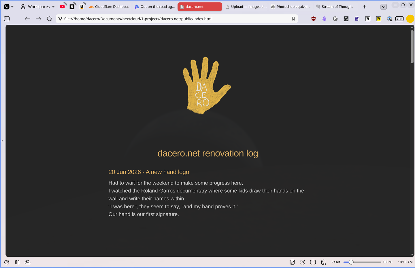
A hand for what this site stands for.
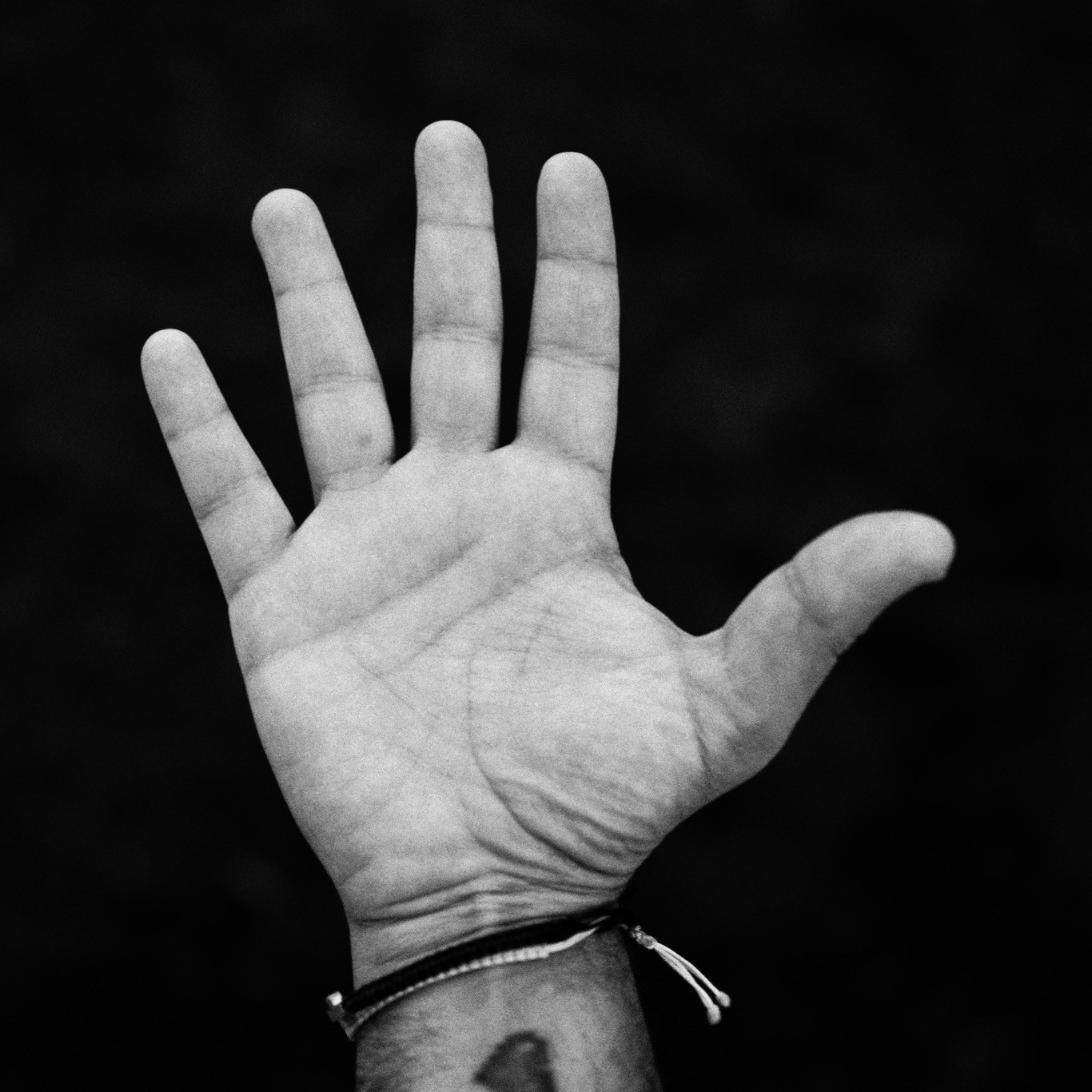
The image style achieved with Snapseed.
Inspired by Patti Smith's A Book of Days.
Let's also get these entries to breath in generous whitespace.
Branding is the art of creating character and connection.
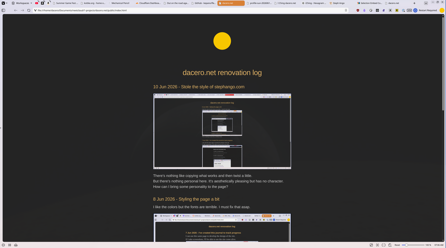
There's nothing like copying what works and then twist a little.
But there's nothing personal here. It's aesthetically pleasing but has no character. How can I bring some personality to the page?
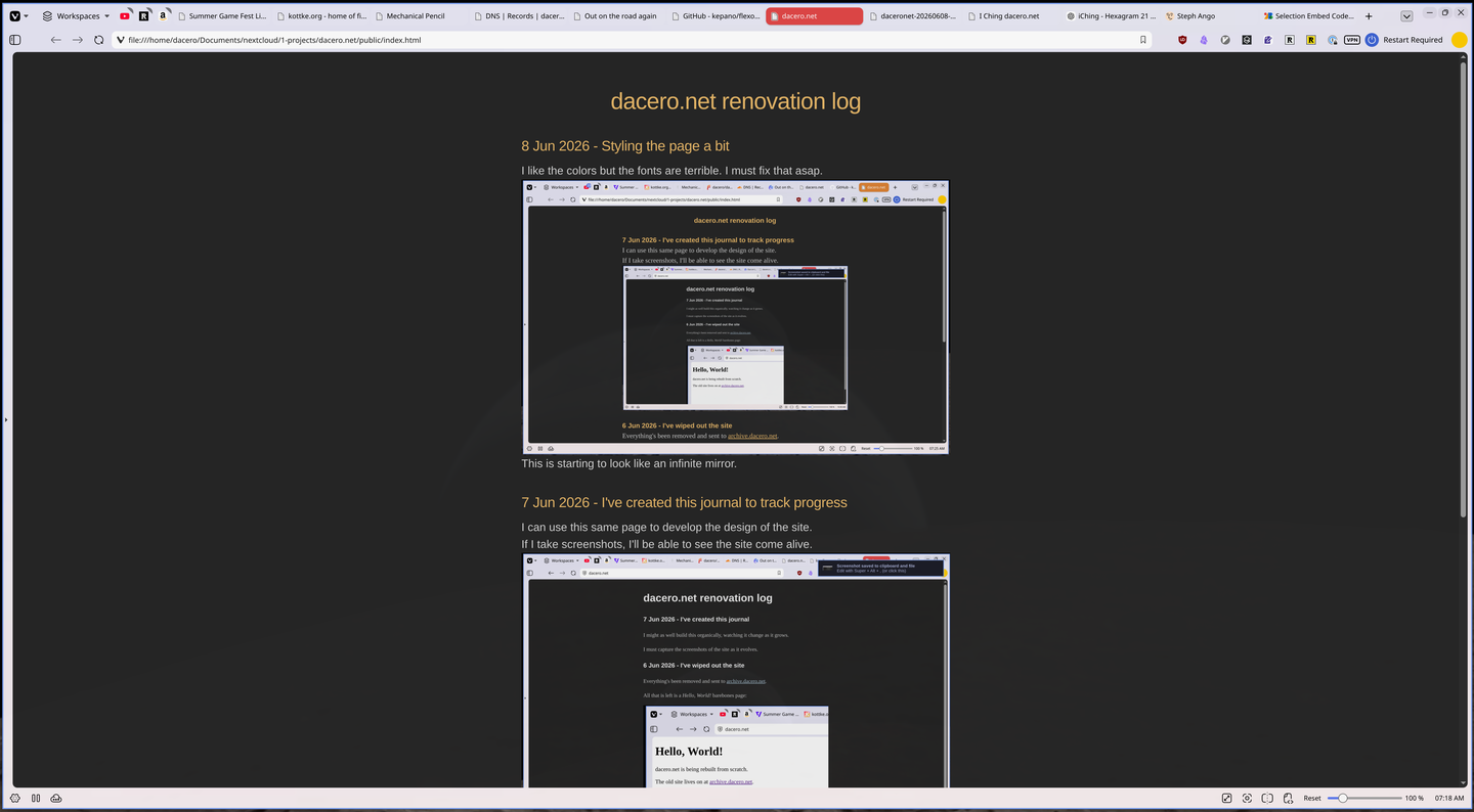
I like the colors but the fonts are terrible. I must fix that asap.
This is starting to look like an infinite mirror.
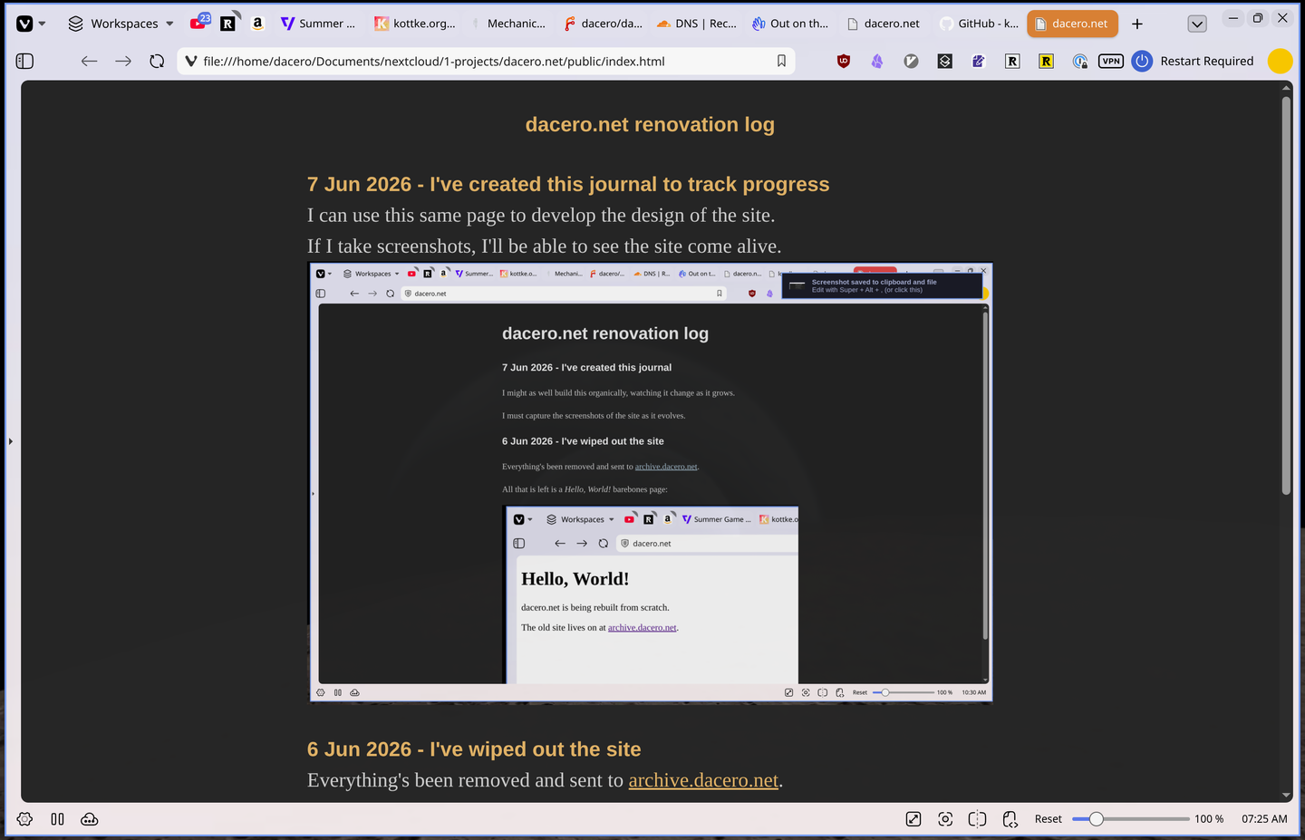
I can use this same page to develop the design of the site.
If I take screenshots, I'll be able to see the site come alive.
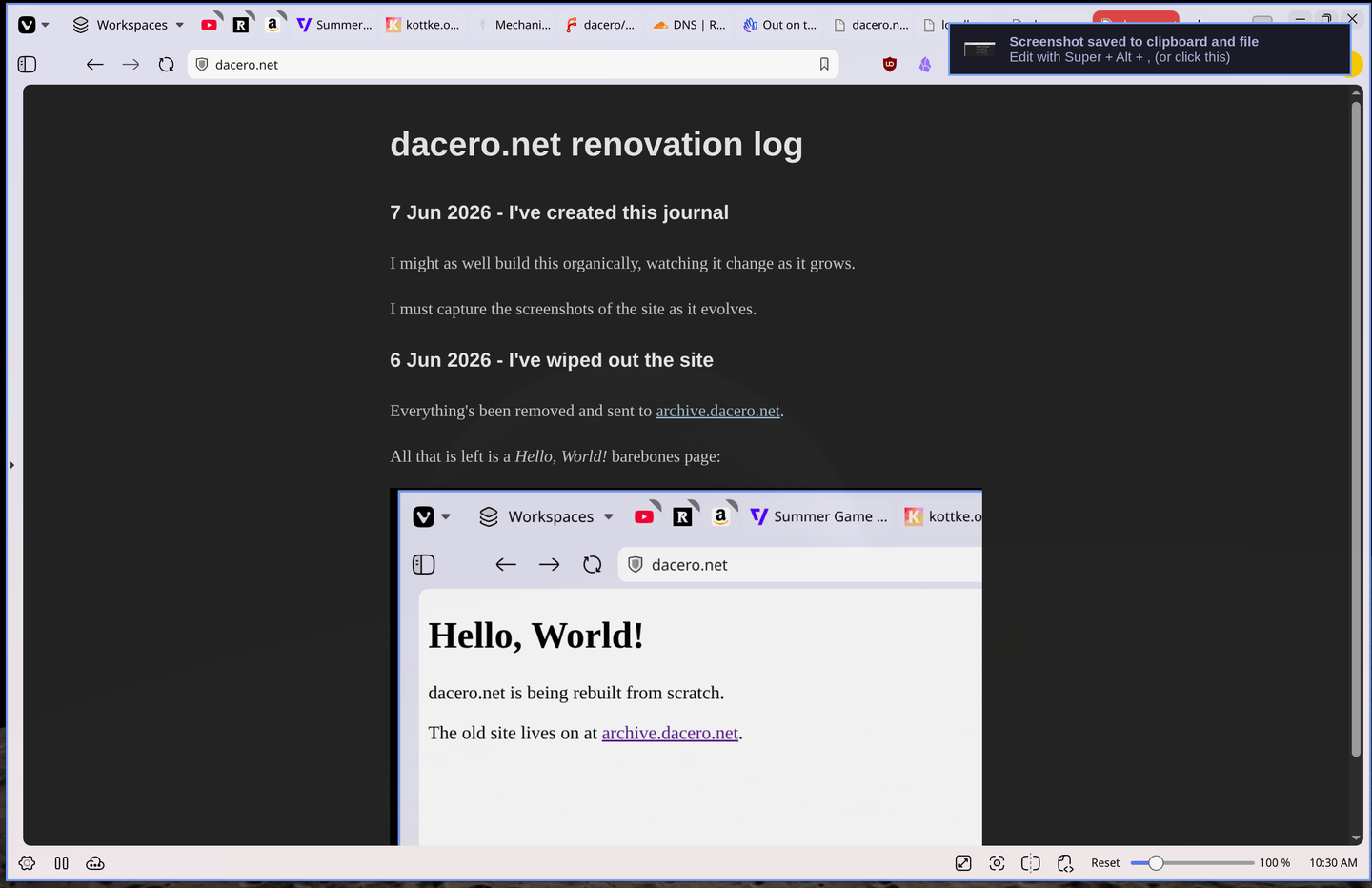
Everything's been removed and sent to archive.dacero.net.
All that is left is a Hello, World! barebones page: